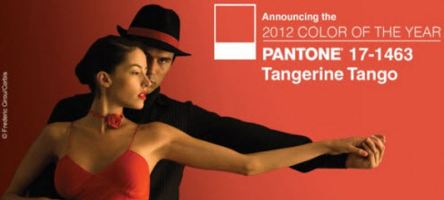
and the pantone colour for 2012 is… tangerine tango

Karen Haller
I always get excited at the end of the year as I know the major forecasting companies are about to announce their colours for the coming year. For 2012 I’m looking at Pantone and I’m not at all surprised by their predication.
not for the faint hearted
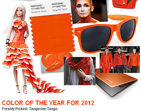
For 2012 Pantone has chosen orange. And not just any orange, but a vibrant reddish orange they call Tangerine Tango. This colour is definitely not for the faint hearted. This colour is bright, lively, vibrant and full of energy. Be warned, there is no rest or respite with this hue!
colour predication
Colour predications are based on many influencing factors, including economics, social, and political. Pantone could have played it safe with a subtle, gentle tone to steer us gently through these uncertain times. But instead it appears they decided to just go for it and provide the ‘energy boost we need to recharge and move forward’!
positive psychological qualities
orange is a combination of both red and yellow. Yellow positively communicates fun, happiness, cheerful and optimism. Red’s positive qualities express energy, stamina, strength and excitement.
When you have orange you get a combination of these qualities to produce a colour that is warm, friendly, fun and playful.
the downside
Too much orange or using the wrong tone in combination with other colours and it can begin to appear a bit frivolous, not taking things seriously.
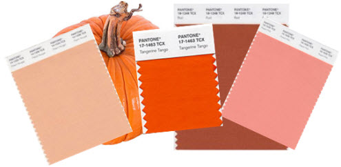
Depending on the strength of the colour it will influence the intensity of the psychological qualities. You will experience a very different feeling when you look at Pantone Tangerine Tango compared to that of soft orange such as peach or apricot or even an autumnal pumpkin orange.
Tangerine Tango is perhaps one of those Marmite colours. You’re either going to love it or hate it. What’s your verdict?
Image credit: Pantone
Love it!
Looks like a winner. I think it will make a fantastic fashion colour, and beautiful, funky and interesting accent colour in interiors.
I love the way you say it represents playfulness too Karen.
Looking forward to see how the forcast manifests over the next 12 months… Laura 🙂
Hi Laura,
There is quite a lot of buzz around this tone of orange. You will probably find that other tones of orange will be available too. It’s then the colours you combine it with to bring it into this century and not a 1970’s time warp!
Yowzers! That’s a colour that you will certainly see coming!
I do like it though – very cheerful.
I’m always fascinated by the names that get given to colours. Is there any reasoning behind it, or just a creative whim?
Tx
Hi Tamsin,
It certainly is bright!
Colour naming is big business – check out my blog article on this very thing…
https://www.karenhaller.co.uk/blog/branding-colour-how-paint-companies-personalities-shines-through-their-paint-colour-names/