silent branding & why business owners need to listen up

Karen Haller
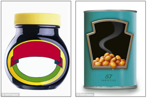
If you were in London earlier this year, you may have heard of Selfridges (the iconic UK department store) ‘No Noise’ project. This is where they and other well-known brands removed their logos from their products, symbolically ‘de-branding’ their products. Their aim was to create a ‘quiet shop’ offering customers a carefully selected range of products that encourage ‘considered purchasing’.
Selfridges’ creative director Alannah Weston said: ‘Selfridges No Noise is a project which invites customers to find a moment of peace in a world where we are bombarded by a cacophony of information and stimulation’.
Now if you have read any of my business branding articles you’ll know I talk about the importance of your business brand colours and the powerful messages they are continually communicating.
“Colour is registered by the brain before either images or typography. Colour increases brand recognition by up to 80%.” – Source: University of Loyla, Maryland study
By removing all the words from the brand packaging, Selfridges certainly did a great job in quieting the conscious mind, where words reside. But what about the unconscious mind, where we register colour before words. As we are only 20% conscious of colour, we may not even be aware by the time we take in the words we have already taken in the colour messages.
Based on my own research, findings and working with clients, colour is often overlooked as another way for your business brand to communicate.
Why Colour isn’t Quiet
Just like words, colour is another form of communication. In fact, before we could speak, colour was our signalling system, our way of non-verbal communication.
Colour is more than just a visual experience; it influences our mood and behaviour. Established research into theories relating to colour and psychology suggest each colour tone has specific effects that influence us on all levels; mental, emotional and physical.
When we see colours, they are sending unconscious messages in a language that we understand instinctively, the language of emotions.
“Colour is our non-verbal way we communicate with each other. It’s anything but quiet…”
To truly create a ‘no noise’, ‘quiet shop’ experience I would recommend they also remove the brand colours as the colours are still engaging the shopper on an emotional, buying level.
How colour communicates
Major brands use their brand colours to engage with their customer’s emotions and encourage them to buy. This is because colour communicates through;
- Grabbing our attention. Colour sends messages quicker to the brain than words or shapes
- Making up for 80% of our buying decisions
- Working directly on our feelings and emotions
- Differentiating your brand from your competitors.
The Emotional Colour Connection
As I mentioned earlier, colour influences our mood and behaviour – we are experiencing the psychological effects of colour.
Whenever we buy anything, it is because of an emotional reason. Afterwards, we justify our choices on the basis of performance or price. We like to think of ourselves as logical beings. But really we buy because of an emotional want, a need, a desire.
The fact is people buy on emotion and colour triggers emotional responses.
The right colour = positive emotional trigger = sales
The wrong colour = negative emotional trigger = no sale
This means that although in the Selfridges project they removed the logo, mark, strap line and words, their ‘quiet store’ was still communicating on an emotional, unconscious level through the brand colours still visible on the products.
Because people react to colour before words or shapes colour is the missing link to making the emotional connection between a brand and its ideal client. Colour is in fact the silent sales force.
Being instantly recognisable through Colour
Major companies understand the importance of brand recognition, being instantly recognised through colour alone. You only have to read my article on Why big brands fiercely protect their brand colours to see just how important this powerful recognition cue is for them.
Back to the ‘No Noise’ project, you can see now that it was anything but noiseless. The brand was still communicating through colour. If anything I think this ‘quiet shop’ project could very well have strengthened brand awareness, with the products still be instantly recognisable.
Understanding this helps us to understand the benefits of using brand colour consciously and to best effect.
Communicating through colour
As a business owner how much thought have you put into the tone and combination of colours that represent your business brand? Do you know what they are actually saying?
Surprisingly, most business owners use colour as mere decoration or as an afterthought. Instead think of colour as a subliminal language, another way to communicate and to attract your ideal clients.
Used to its full effect, your branding colours will give you the competitive edge, elicit the right emotional response from your prospects, and significantly increase your sales.
What do your business branding colours represent? What does it mean for your business brand identity?
Like to know more?
If you would like to know more, then grab your free copy of
7 mistakes most business owners make with their branding colours and how to avoid them.
Please note: The views expressed in this article are based on my own research, findings and working with business owner.


